

Healthy Pregnancy App
Companies: Magee-Womens Research Institute & The Department of Engineering and Public Policy at Carnegie Mellon Institute (In service of an independent study course)
Duration: 5 months
My Role: Designer — UX/UI design, visual design
Team: 1 User Experience Researcher & Designer, 2 Research Scientists
Who is Magee-Womens Research Institute?
Magee-Womens Research Institute (MWRI) is the home for University of Pittsburgh researchers who focus on reproductive biology & development and diverse aspects of women’s health. They pursue a deeper understanding of key physiological processes and diseases that span a woman's entire life cycle. Their mission is to advance scientific knowledge in the fields of reproductive biology & medicine and turn that knowledge into improved health for women and infants. Another goal is to train current and future scholars of reproductive sciences and foster community investment and involvement in women’s health.
Who is the Department of Engineering and Public Policy?
The Department of Engineering and Public Policy (EPP) at Carnegie Mellon University (CMU) is a department that works to solve problems at the interface between technology and society. They offer multiple double-major options to Engineering and Computer Science undergrads. They also off a Master’s degree in Engineering & Technology Innovation and Management and have a research-oriented Ph.D. program. Research in the department mainly focuses on technical innovation, risk analysis and risk communication, information & communication technology and policy, and energy & environmental systems. They have turned their research and findings into useful computer-based tools and quantitative policy analysis.
Prototype
Background
The rate of preterm births increased by more than 30% in between 2011 and 2013 in the United States. Children born preterm are at a higher risk for infant death and health complications. Beyond infancy, preterm birth is a risk factor for a shorter, less healthy life and more challenging school and professional careers. The goal of this project is to create a mobile app for at-risk women, which provides personalized information that could help reduce the risk of preterm birth and provide researchers at MWRI more insights into how behavior factors into preterm births. The app acts as the vehicle for at-risk women to input their behavior and habits and in turn get personalized advice.
Developing the app was a joint venture between MWRI and EEP. The team includes physician researchers at Magee-Women’s Research Institute and experts in Decision Science from Carnegie Mellon University. Research Scientists from the EEP played a critical role because by using their expertise in risk analysis and risk communication. Plus, their ability to leverage their knowledge into information and communication technologies. They developed the algorithms needed to help identify the warning signs of a preterm birth from the data collected by the app and the information system that would provide insights into that data for MWRI Researchers. To help develop the interface for the application the EEP reached out to Human-Computer Interaction department at CMU for students who could work on the project through an independent study.
The first student to work on the project was Master of Human-Computer Interaction student Tina Jose. Tina worked on the project from August 2014 to December 2014 and conducted user research, developed user flows, and created the initial wireframes and prototype. She learned about the market by doing domain research and reviewing over 20 apps in pregnancy market. Tina conducted a card sorting activity with the major stakeholders to help prioritize and group content. Then she used that content to facilitate white-boarding sessions with the Research Scientist to brainstorm ideas for user flow, navigation, and the logic of the app.
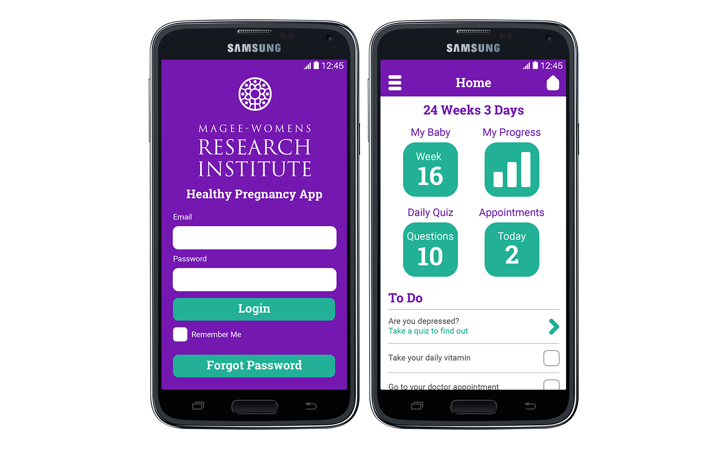
Tina took what she learned from research and collaborative work sessions and refined the user flows & navigation and turned them into wireframes. She went through a few iterations of wireframes incorporating feedback from the team. Then she developed the first prototype to use in interviews with the test group. The test group was made up of women living in Hazelwood, a neighborhood in Pittsburgh that is particularly at-risk for preterm births. Before interviews could start however Tina’s Independent Study concluded. I started the following semester, January 2014, to continue designing the user experience, provide the visual design, create click-through prototypes, and develop usability testing protocols.
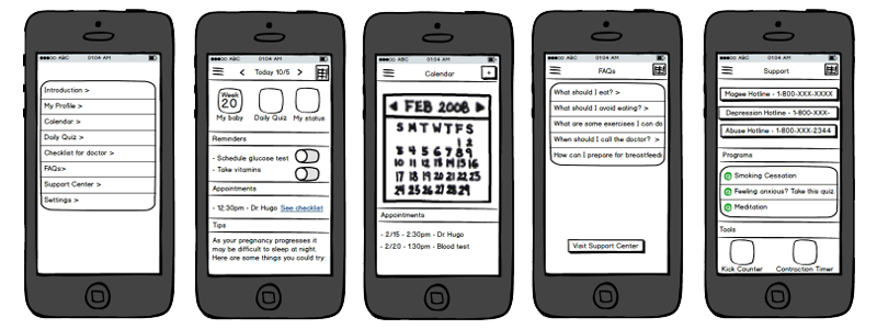
Screens from Tina's initial prototype
Process
Market Research
After reviewing all the initial work done by Tina, I decided to follow a similar path by examining different apps in the pregnancy domain. I wanted to experience them for myself to see what patterns and ideas Tina had adopted. There were also parts of the app that still needed to be designed such as the kick and contraction counters. This research gave me some insight to the patterns already in use. Another reason for doing this research was to help give me ideas for the visual design. I wanted to see the different marketing and branding strategies.
Iterative Design
I started by creating new black and white stylized versions of the existing screen designs. I wanted to get buy in on the aesthetic style early. So, I could incorporate it into the new screens I had to create. The initial reaction was good and only minor tweaks were needed. Getting the visual style done freed me to focus on designing the new components.
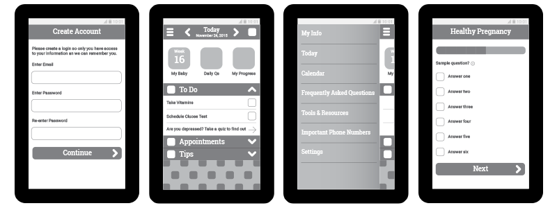
Examples of black and white screens I designed, based on the initial prototype screens created by Tina, to show the visual style.
Creating the new components was done in segments. Sometimes it meant focusing on a few small elements at the same time or only focusing on one large one. I would share my initial designs with the Research Scientists and my Independent Study Advisor to get feedback and then incorporate it into the design. I would share the updated screens for review again. Iteration on a component would continue until the whole team agreed it was in the right place. We started with the most critical parts of the app first to meet the requirements of the Minimal Viable Product (MVP).
Having an MVP components finished first was initially important because originally the plan was to release the app to a test group in the spring. That meant I had to have the design for those components refined, tested, and completed by March. The MVP included everything but the kick and contraction counters. After completion of the MVP components, I created a prototype and usability test protocol.
Usability testing for this project was a challenge. The Research Scientists were interviewing at-risk mothers as part of their research into behaviors and habits. Initially, the intention was that I would accompany them and conduct the usability test. However, they were having a hard time getting women to commit to interviews. It’s a very sensitive subject, and it’s hard to get people to be open and honest about it. Learning this gave me pause because I thought a male with no children being a part of the process might be disruptive and disingenuous. I worried it could add to the pressure the interviewee was experiencing and prevent them from participating in future interviews. I raised this concern to the team, and they agreed. So, we took the protocol I wrote, broke up the tasks and modified them slightly. Then they were smoothly incorporated into the interview questions being asked by the Research Scientists.
The Research Scientists would then conduct usability testing as part of their interviews. They would annotate the challenges and pain points the participants encountered. Unfortunately, the amount willing participants was a small group. After 2 or 3 interviews we would combine and prioritize the issues. I would then modify the design to address the issues and update the prototype so it could be used in the next group of interviews. This testing provided us with some great insights into hierarchy and labeling issues.
An excellent example of insight we gained from usability testing is how the Info For Doctor feature evolved. The feature shows the Doctor user behaviors that will have a negative effect on the pregnancy. It also enables the users to make a note about something they want to bring up at their next doctor’s visit. Initially, the feature was called Checklist. The term Checklist was confusing to users because they had no idea what purpose it served. Then we tried calling it Dr’s Checklist, and this confused users as well. They didn’t think it would be a list of notes for the Doctor to review. Instead, they thought it was a list of tasks to be completed by their Doctors. That led to us changing the label to Info For Doctor. We also learned that the users wanted quicker access to the Add Note screen. Initially, they had to go through the Info For Doctor screen to access the Add Note action. To give the user quicker access, we added the Add Note For Doctor item to the Menu.
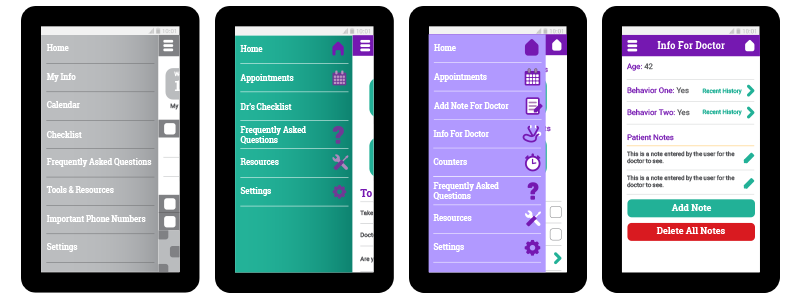
These screens show the evolution of the label for the Info For Doctor item on the Menu. From left to right: Menu screen with the original label, Menu screen with the second option label, Menu screen with the final label, the Info For Doctor screen.
Visual Design
My goal for the visual design was to make it feel playful because the majority of interactions users would experience would be data entry, and that the repetitiveness of that is boring. I started by rounding all the corners. I made the corner radius for all the buttons very high to make them feel soft. For header and title text I used the typeface Roboto Slab because the serifs are blocky and some of them have a little bit of a curve. That little bit of curve helped reinforce the soft feeling I wanted. Then I explored a color palette to use.
I wanted to avoid stereotypes when it came to choosing colors for the app. Almost every app I saw in the pregnancy market used pink. I still wanted a color that felt maternal like pink does, though. So, I experimented with different hues of purple and then complementary colors. I went with colors that are bright and vibrant. The bright colors combined with the softness of the corners made the design feel a little bouncy which makes the app look playful.
I applied the visual style to all the screens, and I then started to illustrate icons to match the aesthetics. The majority of these I created from scratch. I did use a few royalty free vector icons but extensively modified them to match the style. I stuck with the round corners and bouncy colors, but I did have to expand the color palate to make it work. I ended up adding a few different shades of purple. Which gave me the flexibility I needed.
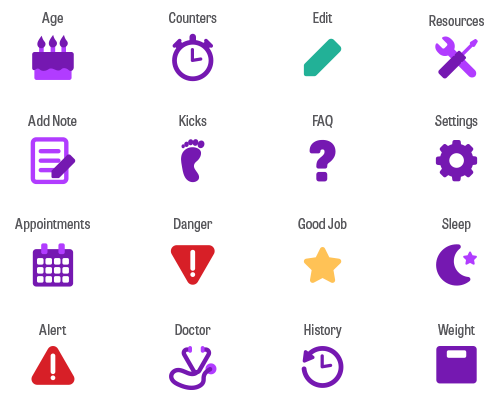
A sample of the icons I created for the app.
Conclusion
Overall the design for the app turned out great. I wish I had been around to work with the team building the app. Then I would have been able to explore some animations that would drive home the playful feel. A small agency built the app shortly after I finished my independent study and it used in a pilot program. The results were positive. It helped a few of the women identify problems and get the help they needed which contributed to a healthy pregnancy. Also because of the success of the pilot program, MWRI and EPP plan to scale the app for public use.